 Ze'ev Schurmann
1e0bb18e01
Ze'ev Schurmann
1e0bb18e01
|
||
|---|---|---|
| .. | ||
| README.md | ||
| beating-heart.gif | ||
| beating-heart.html | ||
| beating-heart.mp4 | ||
| beating-heart.webm | ||
README.md
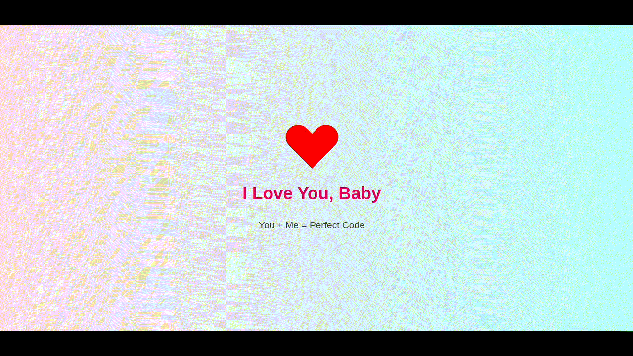
Beating Heart
This is a nice effect of a heart being constructed step by step then animating with a double pulse like a heart beat. You can customize this to send someone a love letter or a digital valentine.
The CSS Explained
Inside the HTML file is some CSS code. Let's take a look at the various elements...
Tags
body
This block of CSS defines the formatting for the entire HTML document. Every element inside the <body></body> tags will inherit these settings.
    body {
      background: linear-gradient(to right, #ffdee9, #b5fffc);
      display: flex;
      justify-content: center;
      align-items: center;
      height: 100vh;
      flex-direction: column;
      font-family: 'Segoe UI', sans-serif;
    }
- First we set a background gradient going from left to right. (https://www.w3schools.com/css/css3_gradients.asp)
- We define the display as a flex mode. (https://www.w3schools.com/css/css3_flexbox.asp)
- We set the content justification to center so that the content is in the vertical center of the viewport. (https://www.w3schools.com/css/css_align.asp)
- We set the content alignment to center so that the content is in the horizontal center of the viewport. (https://www.w3schools.com/css/css_align.asp)
- We define the height of the viewport to 100% of the viewport height where 1vh = 1% of viewport height. (https://www.w3schools.com/cssref/css_units.php)
- We set the flex direction from top to bottom.
- We define the font to be used as Sefoe UI or to fall back to the system default sans-serif font as defined in the users operating system.
h1
This CSS block defines custom formatting for all <h1></h1> tags.
    h1 {
      color: #e6005c;
      margin-top: 30px;
      font-size: 2.2em;
    }
- Using RGB Hex Values, the color is defined as 230 Red (e6), 0 Green (00) and 92 Blue (5c).
- The top margin is set to 30 pixels.
- The font size is set to 2.2 X the inherited font size, which in this case is the browser's default font size for H1.
p
This CSS block defines custom formatting for all <p></p> tags.
    p {
      font-size: 1.2em;
      margin-top: 10px;
      color: #444;
    }
- The font size is set to 1.2 times the inherited font size, which in this case is the browser's default font size for P.
- The top margin is set to 10 pixels.
- Using singled digit RGB Hex Values, the color is defined as 60 Red (4), 68 Green (4) and 68 Blue (4).
Classes
.heart
This block creates the area where we will draw and animate our heart.
    .heart {
      width: 100px;
      height: 90px;
      position: relative;
      animation: beat 1.5s infinite 10s;
    }
- The width of the area is set to 100 pixels.
- The height of the area is set to 90 pixels.
- The position of the contents of this area are defined as relative from the top left 0px 0px to the bottom right 100px 90px.
- The animation
beatis run as an infinite loop, where the keyframes are cycled from 0% to 100% every 1.5 seconds. The animation is also delayed to start 10 seconds after page load so that other animations can complete first.
.heart::before, .heart::after
This block creates two additional areas, one before and one after the .heart area, and overlaps them with the .heart area.
    .heart::before,
    .heart::after {
      content: "";
      position: absolute;
      width: 1px;
      height: 1px;
      background: red;
      border-radius: 0 0 0 0;
    }
- The content is left blank.
- The position of each of the additional areas is absolute to the original area, thus being top left 0px 0px and bottom right 100px 90px.
- The starting width of each of the additional areas is set to 1 pixel.
- The starting height of each of the additional areas is set to 1 pixel.
- The background color of each of the additional areas is set to Red (same as #ff0000 or #f00).
- The starting radius of the corners for each of the additional areas are set to 0, resulting in square corners.
.heart::before
This block adds formatting and the animations that are unique to the area created before the .heart area.
    .heart::before {
      left: 0px;
      transform: rotate(0deg);
      transform-origin: 0% 100%;
      animation: heartone 5s forwards, hearttwo 5s forwards 5s;
    }
- The starting position of the area is set to 0 pixels from the left of
.heartarea. - The starting rotation of the area is set to 0 degrees.
- The point at which the rotation will pivot is set to 0% (most left) and 100% (most bottom) of the area.
- Two animations are run,
heartonefor 5 seconds with no repeat, andhearttwofor 5 seconds with no repeat but with a 5 second delay in order to allow the first animation to complete.
.heart::after
This block adds formatting and the animations that are unique to the area created after the .heart area.
    .heart::after {
      left: 0px;
      transform: rotate(0deg);
      transform-origin: 100% 100%;
      animation: heartone 5s forwards, heartthree 5s forwards 5s;
    }
- The starting position of the area is set to 0 pixels from the left of
.heartarea. - The starting rotation of the area is set to 0 degrees.
- The point at which the rotation will pivot is set to 100% (most right) and 100% (most bottom) of the area.
- Two animations are run,
heartonefor 5 seconds with no repeat, andheartthreefor 5 seconds with no repeat but with a 5 second delay in order to allow the first animation to complete.
Animations
Animations are set using @keyframes blocks in CSS. In this example, we are using percentages to define the positions of an animation run. 0% being the start and 100% being the end. When an animation loops, then 100% is followed by 0%. (https://www.w3schools.com/cssref/atrule_keyframes.php)
heartone
This block defines the keyframes for the animation called heartone.
    @keyframes heartone {
      0% {
        width: 1px;
        height: 1px;
        border-radius: 0 0 0 0;
      }
      50% {
        width: 50px;
        height: 90px;
        border-radius: 0 0 0 0;
      }
      100% {
        width: 50px;
        height: 90px;
        border-radius: 50px 50px 0 0;
      }
    }
At 0%:
- The width is defined at 1 pixel.
- The height is defined at 1 pixel.
- The border radiuses are defined at 0.
At 50%:
- The width will gradually change until it reaches 50 pixels.
- The height will gradually change until it reaches 90 pixels.
- The border radiuses will remain at 0.
At 100%:
- The width will remain at 50 pixels.
- The height will remain at 90 pixels.
- The top left radius and top right radius will gradually change to 50 pixels. The bottom right and bottom left will remain 0 pixels.
hearttwo
This block defines the keyframes for the animation called hearttwo.
    @keyframes hearttwo {
      0% {
        left: 0px;
        transform: rotate(0deg);
        transform-origin: 0% 100%;
      }
      50% {
        left: 50px;
        transform: rotate(0deg);
        transform-origin: 0% 100%;
      }
      100% {
        left: 50px;
        transform: rotate(-45deg);
        transform-origin: 0% 100%;
      }
    }
At 0%:
- The position of the area is defined to be 0 pixels from the left.
- The area is defined to start with a 0 degree rotation.
- The point at which the rotation will pivot is set to 0% (most left) and 100% (most bottom) of the area.
At 50%:
- The position of the area is gradually moved 50 pixels from the left.
- The area is kept with a 0 degree rotation.
- The point at which the rotation will pivot is kept at 0% (most left) and 100% (most bottom) of the area.
At 100%:
- The position of the area is kept at 50 pixels from the left.
- The area will gradually rotate clockwise by 45 degrees.
- The point at which the rotation will pivot is kept at 0% (most left) and 100% (most bottom) of the area.
heartthree
This block defines the keyframes for the animation called heartthree.
    @keyframes heartthree {
      0% {
        left: 0px;
        transform: rotate(0deg);
        transform-origin: 100% 100%;
      }
      50% {
        left: 0px;
        transform: rotate(0deg);
        transform-origin: 100% 100%;
      }
      100% {
        left: 0px;
        transform: rotate(45deg);
        transform-origin: 100% 100%;
      }
    }
At 0%:
- The position of the area is defined to be 0 pixels from the left.
- The area is defined to start with a 0 degree rotation.
- The point at which the rotation will pivot is kept at 100% (most right) and 100% (most bottom) of the area.
At 50%:
- The position of the area is kept at 0 pixels from the left.
- The area is kept with a 0 degree rotation.
- The point at which the rotation will pivot is kept at 100% (most right) and 100% (most bottom) of the area.
At 100%:
- The position of the area is kept at 0 pixels from the left.
- The area will gradually rotate counter-clockwise by 45 degrees.
- The point at which the rotation will pivot is kept at 100% (most right) and 100% (most bottom) of the area.
beat
This block defines the keyframes for the animation called beat.
    @keyframes beat {
      0%, 30%, 50%, 70%, 100% {
        transform: scale(1);
      }
      40% {
        transform: scale(1.5) skewY(-15deg);
      }
      60% {
        transform: scale(1.5) skewY(15deg);
      }
    }
At 0%:
- The scale of the area is set to 100% of it's inherited size.
At 30%:
- The scale of the area remains at 100% of it's inherited size.
At 40%:
- The scale of the area is gradually changed to 150% of it's inherited size.
- The area is gradually skewed on the Y axis by 15 degrees counter-clockwise.
At 50%:
- The scale of the area is gradually changed to 100% of it's inherited size.
- Because skewY is omitted, the previous skew transformation is gradually reverted.
At 60%:
- The scale of the area is gradually changed to 150% of it's inherited size.
- The area is gradually skewed on the Y axis by 15 degrees clockwise.
At 70%:
- The scale of the area is gradually changed to 100% of it's inherited size.
- Because skewY is omitted, the previous skew transformation is gradually reverted.
At 100%:
- The scale of the area remains at 100% of it's inherited size.