310 lines
10 KiB
Markdown
310 lines
10 KiB
Markdown
# Beating Heart
|
|
|
|
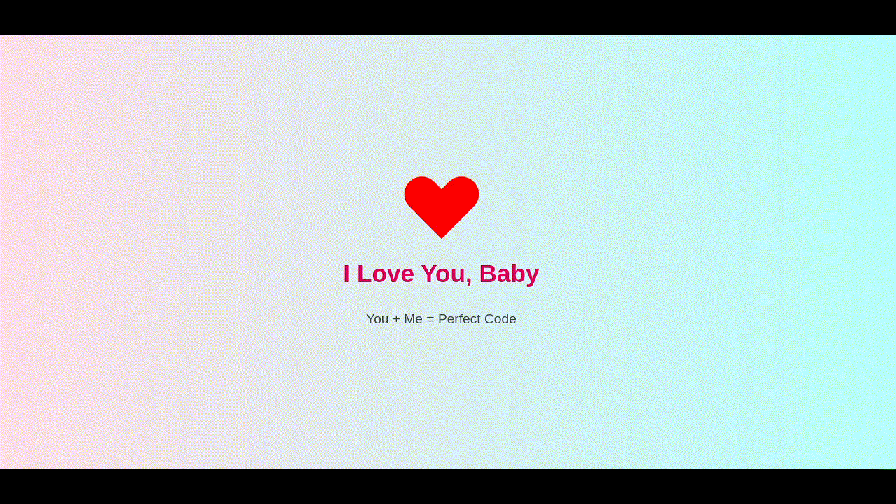
This is a nice effect of a heart being constructed step by step then animating with a double pulse like a heart beat. You can customize this to send someone a love letter or a digital valentine.
|
|
|
|
|
|
|
|
# The CSS Explained
|
|
|
|
Inside the HTML file is some CSS code. Let's take a look at the various elements...
|
|
|
|
## Tags
|
|
|
|
### body
|
|
|
|
This block of CSS defines the formatting for the entire HTML document. Every element inside the `<body></body>` tags will inherit these settings.
|
|
|
|
````CSS
|
|
body {
|
|
background: linear-gradient(to right, #ffdee9, #b5fffc);
|
|
display: flex;
|
|
justify-content: center;
|
|
align-items: center;
|
|
height: 100vh;
|
|
flex-direction: column;
|
|
font-family: 'Segoe UI', sans-serif;
|
|
}
|
|
````
|
|
|
|
1. First we set a background gradient going from left to right. (https://www.w3schools.com/css/css3_gradients.asp)
|
|
2. We define the display as a flex mode. (https://www.w3schools.com/css/css3_flexbox.asp)
|
|
3. We set the content justification to center so that the content is in the vertical center of the viewport. (https://www.w3schools.com/css/css_align.asp)
|
|
4. We set the content alignment to center so that the content is in the horizontal center of the viewport. (https://www.w3schools.com/css/css_align.asp)
|
|
5. We define the height of the viewport to 100% of the viewport height where 1vh = 1% of viewport height. (https://www.w3schools.com/cssref/css_units.php)
|
|
6. We set the flex direction from top to bottom.
|
|
7. We define the font to be used as **Sefoe UI** or to fall back to the system default sans-serif font as defined in the users operating system.
|
|
|
|
### h1
|
|
|
|
This CSS block defines custom formatting for all `<h1></h1>` tags.
|
|
|
|
````css
|
|
h1 {
|
|
color: #e6005c;
|
|
margin-top: 30px;
|
|
font-size: 2.2em;
|
|
}
|
|
````
|
|
|
|
1. Using RGB Hex Values, the color is defined as 230 Red (e6), 0 Green (00) and 92 Blue (5c).
|
|
2. The top margin is set to 30 pixels.
|
|
3. The font size is set to 2.2 X the inherited font size, which in this case is the browser's default font size for H1.
|
|
|
|
### p
|
|
|
|
This CSS block defines custom formatting for all `<p></p>` tags.
|
|
|
|
````css
|
|
p {
|
|
font-size: 1.2em;
|
|
margin-top: 10px;
|
|
color: #444;
|
|
}
|
|
````
|
|
|
|
1. The font size is set to 1.2 times the inherited font size, which in this case is the browser's default font size for P.
|
|
2. The top margin is set to 10 pixels.
|
|
3. Using singled digit RGB Hex Values, the color is defined as 60 Red (4), 68 Green (4) and 68 Blue (4).
|
|
|
|
## Classes
|
|
|
|
### .heart
|
|
|
|
This block creates the area where we will draw and animate our heart.
|
|
|
|
````css
|
|
.heart {
|
|
width: 100px;
|
|
height: 90px;
|
|
position: relative;
|
|
animation: beat 1.5s infinite 10s;
|
|
}
|
|
````
|
|
|
|
1. The width of the area is set to 100 pixels.
|
|
2. The height of the area is set to 90 pixels.
|
|
3. The position of the contents of this area are defined as relative from the top left 0px 0px to the bottom right 100px 90px.
|
|
4. The animation `beat` is run as an infinite loop, where the keyframes are cycled from 0% to 100% every 1.5 seconds. The animation is also delayed to start 10 seconds after page load so that other animations can complete first.
|
|
|
|
### .heart::before, .heart::after
|
|
|
|
This block creates two additional areas, one before and one after the `.heart` area, and overlaps them with the `.heart` area.
|
|
|
|
````css
|
|
.heart::before,
|
|
.heart::after {
|
|
content: "";
|
|
position: absolute;
|
|
width: 1px;
|
|
height: 1px;
|
|
background: red;
|
|
border-radius: 0 0 0 0;
|
|
}
|
|
````
|
|
|
|
1. The content is left blank.
|
|
2. The position of each of the additional areas is absolute to the original area, thus being top left 0px 0px and bottom right 100px 90px.
|
|
3. The starting width of each of the additional areas is set to 1 pixel.
|
|
4. The starting height of each of the additional areas is set to 1 pixel.
|
|
5. The background color of each of the additional areas is set to Red (same as #ff0000 or #f00).
|
|
6. The starting radius of the corners for each of the additional areas are set to 0, resulting in square corners.
|
|
|
|
### .heart::before
|
|
|
|
This block adds formatting and the animations that are unique to the area created before the `.heart` area.
|
|
|
|
````css
|
|
.heart::before {
|
|
left: 0px;
|
|
transform: rotate(0deg);
|
|
transform-origin: 0% 100%;
|
|
animation: heartone 5s forwards, hearttwo 5s forwards 5s;
|
|
}
|
|
````
|
|
|
|
1. The starting position of the area is set to 0 pixels from the left of `.heart` area.
|
|
2. The starting rotation of the area is set to 0 degrees.
|
|
3. The point at which the rotation will pivot is set to 0% (most left) and 100% (most bottom) of the area.
|
|
4. Two animations are run, `heartone` for 5 seconds with no repeat, and `hearttwo` for 5 seconds with no repeat but with a 5 second delay in order to allow the first animation to complete.
|
|
|
|
### .heart::after
|
|
|
|
This block adds formatting and the animations that are unique to the area created after the `.heart` area.
|
|
|
|
````css
|
|
.heart::after {
|
|
left: 0px;
|
|
transform: rotate(0deg);
|
|
transform-origin: 100% 100%;
|
|
animation: heartone 5s forwards, heartthree 5s forwards 5s;
|
|
}
|
|
````
|
|
|
|
1. The starting position of the area is set to 0 pixels from the left of `.heart` area.
|
|
2. The starting rotation of the area is set to 0 degrees.
|
|
3. The point at which the rotation will pivot is set to 100% (most right) and 100% (most bottom) of the area.
|
|
4. Two animations are run, `heartone` for 5 seconds with no repeat, and `heartthree` for 5 seconds with no repeat but with a 5 second delay in order to allow the first animation to complete.
|
|
|
|
## Animations
|
|
|
|
Animations are set using `@keyframes` blocks in CSS. In this example, we are using percentages to define the positions of an animation run. 0% being the start and 100% being the end. When an animation loops, then 100% is followed by 0%. (https://www.w3schools.com/cssref/atrule_keyframes.php)
|
|
|
|
### heartone
|
|
|
|
This block defines the keyframes for the animation called `heartone`.
|
|
|
|
````css
|
|
@keyframes heartone {
|
|
0% {
|
|
width: 1px;
|
|
height: 1px;
|
|
border-radius: 0 0 0 0;
|
|
}
|
|
50% {
|
|
width: 50px;
|
|
height: 90px;
|
|
border-radius: 0 0 0 0;
|
|
}
|
|
100% {
|
|
width: 50px;
|
|
height: 90px;
|
|
border-radius: 50px 50px 0 0;
|
|
}
|
|
}
|
|
````
|
|
|
|
**At 0%:**
|
|
1. The width is defined at 1 pixel.
|
|
2. The height is defined at 1 pixel.
|
|
3. The border radiuses are defined at 0.
|
|
|
|
**At 50%:**
|
|
1. The width will gradually change until it reaches 50 pixels.
|
|
2. The height will gradually change until it reaches 90 pixels.
|
|
3. The border radiuses will remain at 0.
|
|
|
|
**At 100%:**
|
|
1. The width will remain at 50 pixels.
|
|
2. The height will remain at 90 pixels.
|
|
3. The top left radius and top right radius will gradually change to 50 pixels. The bottom right and bottom left will remain 0 pixels.
|
|
|
|
### hearttwo
|
|
|
|
This block defines the keyframes for the animation called `hearttwo`.
|
|
|
|
````css
|
|
@keyframes hearttwo {
|
|
0% {
|
|
left: 0px;
|
|
transform: rotate(0deg);
|
|
transform-origin: 0% 100%;
|
|
}
|
|
50% {
|
|
left: 50px;
|
|
transform: rotate(0deg);
|
|
transform-origin: 0% 100%;
|
|
}
|
|
100% {
|
|
left: 50px;
|
|
transform: rotate(-45deg);
|
|
transform-origin: 0% 100%;
|
|
}
|
|
}
|
|
````
|
|
|
|
**At 0%:**
|
|
1. The position of the area is defined to be 0 pixels from the left.
|
|
2. The area is defined to start with a 0 degree rotation.
|
|
3. The point at which the rotation will pivot is set to 0% (most left) and 100% (most bottom) of the area.
|
|
|
|
**At 50%:**
|
|
1. The position of the area is gradually moved 50 pixels from the left.
|
|
2. The area is kept with a 0 degree rotation.
|
|
3. The point at which the rotation will pivot is kept at 0% (most left) and 100% (most bottom) of the area.
|
|
|
|
**At 100%:**
|
|
1. The position of the area is kept at 50 pixels from the left.
|
|
2. The area will gradually rotate clockwise by 45 degrees.
|
|
3. The point at which the rotation will pivot is kept at 0% (most left) and 100% (most bottom) of the area.
|
|
|
|
### heartthree
|
|
|
|
This block defines the keyframes for the animation called `heartthree`.
|
|
|
|
````css
|
|
@keyframes heartthree {
|
|
0% {
|
|
left: 0px;
|
|
transform: rotate(0deg);
|
|
transform-origin: 100% 100%;
|
|
}
|
|
50% {
|
|
left: 0px;
|
|
transform: rotate(0deg);
|
|
transform-origin: 100% 100%;
|
|
}
|
|
100% {
|
|
left: 0px;
|
|
transform: rotate(45deg);
|
|
transform-origin: 100% 100%;
|
|
}
|
|
}
|
|
````
|
|
|
|
**At 0%:**
|
|
1. The position of the area is defined to be 0 pixels from the left.
|
|
2. The area is defined to start with a 0 degree rotation.
|
|
3. The point at which the rotation will pivot is kept at 100% (most right) and 100% (most bottom) of the area.
|
|
|
|
**At 50%:**
|
|
1. The position of the area is kept at 0 pixels from the left.
|
|
2. The area is kept with a 0 degree rotation.
|
|
3. The point at which the rotation will pivot is kept at 100% (most right) and 100% (most bottom) of the area.
|
|
|
|
**At 100%:**
|
|
1. The position of the area is kept at 0 pixels from the left.
|
|
2. The area will gradually rotate counter-clockwise by 45 degrees.
|
|
3. The point at which the rotation will pivot is kept at 100% (most right) and 100% (most bottom) of the area.
|
|
|
|
### beat
|
|
|
|
This block defines the keyframes for the animation called `beat`.
|
|
|
|
````css
|
|
@keyframes beat {
|
|
0%, 30%, 50%, 70%, 100% {
|
|
transform: scale(1);
|
|
}
|
|
40% {
|
|
transform: scale(1.5) skewY(-15deg);
|
|
}
|
|
60% {
|
|
transform: scale(1.5) skewY(15deg);
|
|
}
|
|
}
|
|
````
|
|
|
|
**At 0%:**
|
|
1. The scale of the area is set to 100% of it's inherited size.
|
|
|
|
**At 30%:**
|
|
1. The scale of the area remains at 100% of it's inherited size.
|
|
|
|
**At 40%:**
|
|
1. The scale of the area is gradually changed to 150% of it's inherited size.
|
|
2. The area is gradually skewed on the Y axis by 15 degrees counter-clockwise.
|
|
|
|
**At 50%:**
|
|
1. The scale of the area is gradually changed to 100% of it's inherited size.
|
|
2. Because skewY is omitted, the previous skew transformation is gradually reverted.
|
|
|
|
**At 60%:**
|
|
1. The scale of the area is gradually changed to 150% of it's inherited size.
|
|
2. The area is gradually skewed on the Y axis by 15 degrees clockwise.
|
|
|
|
**At 70%:**
|
|
1. The scale of the area is gradually changed to 100% of it's inherited size.
|
|
2. Because skewY is omitted, the previous skew transformation is gradually reverted.
|
|
|
|
**At 100%:**
|
|
1. The scale of the area remains at 100% of it's inherited size. |